It's been awhile since we've discussed the most important topic of all - college football. As I'm sure y'all are aware, the NCAA has decided to allow a four team playoff. The fact that it will end up being chock-full of SEC teams is something that will be fun to watch. The Big 10 (or whatever they're calling themselves these days) will be the hardest hit.
Almost as important as the playoff system itself is the logo that goes along with it. First, the name "College Football Playoff" isn't that great, so we're going to need an awesome logo to make people forget about how bland the name is.
Ok, so here are the four finalists. The final four. Sigh...It just kind of makes you realize all over again how stupid the name "College Football Playoff" is in comparison to March Madness, The Final Four, The SuperBowl, etc.... Where's Don Draper when you really need him? He'd be all over this.
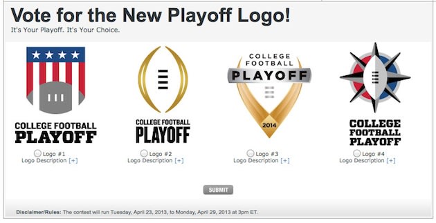
Logo #1 Bastardized American Flag Football. Ok, so the first one (starting from the left) looks like a weird version of Captain America's shield with a football at the bottom. If we maybe had Captain Football America as a superhero to go with it, that could be promising. However, it just looks like a bastardized American flag with too few stripes and stars. And flags are supposed to be squared off and the bottom, not football curved. What are we looking at? Not really thrilled with this one.
Logo #2 Football Eye of Sauron. Sorry, I can't claim credit for coming up with that. It belongs to @edsbs, but not that I've started thinking about it being the Eye of Sauron, it's not going to look like anything else. Damn you Spencer Hall! Can't use this one - I'll have nightmares about it.
Logo #3 Insect Antenna. This looks like a weird type of insect's antenna that's been plucked off, or some kind of pincher from an ant. It kind of gives me the creeps. I know that it's supposed to be a silhouette of a football, but good god man, what kind of crazy pincher is that thing? (Warning: Do not click on that link if you are scared of bugs.)
Logo #4 Game of Thrones. Did someone take a bunch of swords and put them under a football? This one could be promising if you got some players and coaches to do commercials where they say "In college football, you either win, or you die". As I've pointed out, college football is already so much like the warring houses of Westeros anyway, this may not actually be a bad fit.
Overall, I'm not really amazed by any of these logos. Your thoughts?
No comments:
Post a Comment