Showing posts with label charts. Show all posts

Monday, August 4, 2014

Top Five Venn Diagrams

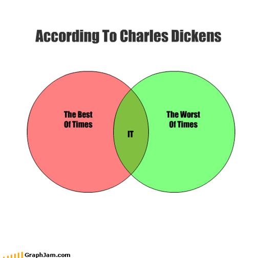
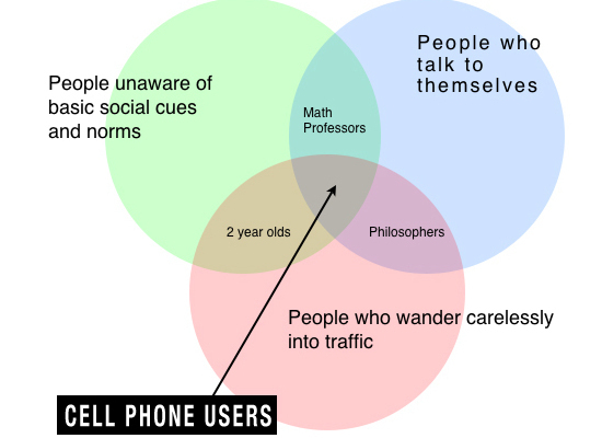
If you hadn't noticed the Google Doodle today, it's John Venn's 180th birthday. To celebrate, I'm giving you my top five favorite Venn diagrams.

1. Parenting.


2. Social behaviors.


3. Literary.


4. Cooking.


5. Religious.


Friday, May 2, 2014

Unemployment Rate in One Graph


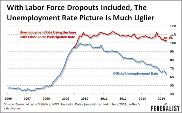
Not so much. Look at this chart.


The unemployment rate (the blue line) is at it's lowest rate Since September of 2008. That's good right?

The reason that the unemployment rate is at a 5 year low is because the amount of people looking for work (the labor force participation rate) is at a thirty year low. Thirty. Years. If you're not an economist, what this means is that if you're not "looking for work" you're not counted as "unemployed". Therefore, we're just not counting as many people as "unemployed" not because they have jobs, but because they don't have jobs and aren't looking for jobs.

The red line represents what the unemployment rate would actually be if we used the same numbers of people looking for jobs as we did in June 2009.

So you can dance the happy dance all you want because the unemployment rate went down, but you're kind of fooling yourself if you think it went down because the economy is heating up.

Remember, First Quarter GDP was 0.1%. That's almost no growth in the economy at all. Excuse me if I refrain from doing a happy dance just yet.


Monday, February 10, 2014

A Century of Meat in the USA [chart]

Happy Monday.

Here's an interesting chart about the US consumption of meat over the last hundred years.


You can see the larger version here.

Two interesting things jump out at me. First, pork is really volatile, while fish and shellfish is really stable. I'm not sure what drives that. Also, the big winner over the last hundred years is chicken.

What are you eating?