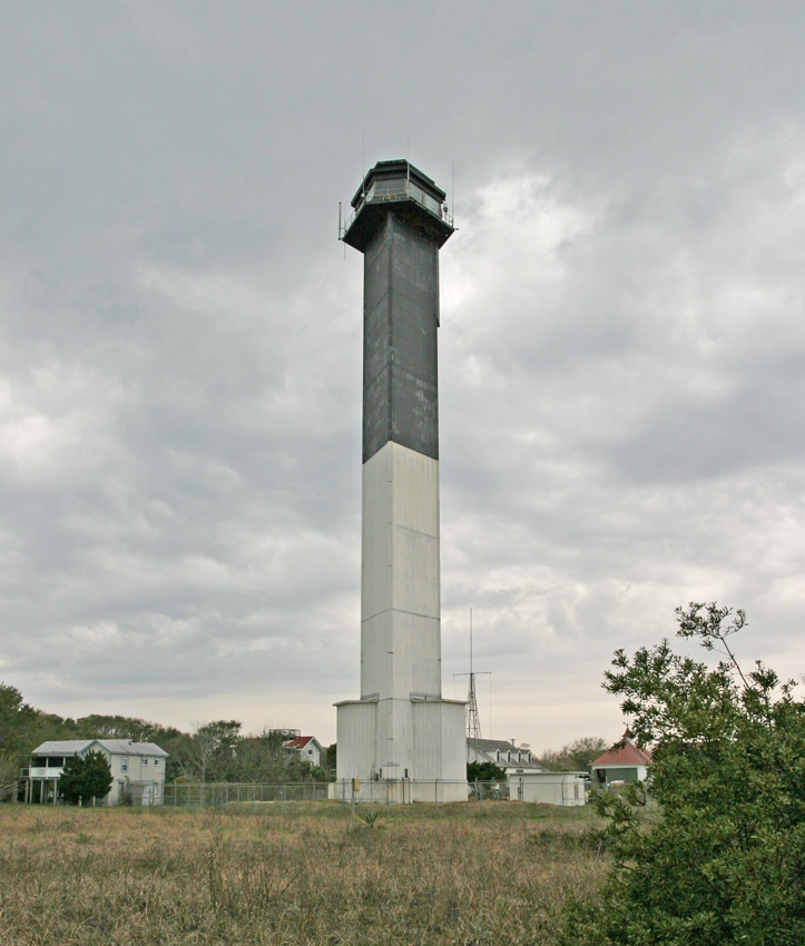
Designed by Jack Graham, who studied under architect Louis Kahn at the University of Pennsylvania, the light was the second-brightest in the Western Hemisphere when it was commissioned with 26 million candlepower. That proved much too bright for the locals, and the Coast Guard reduced the light to 1.5 million candlepower.Also, island residents didn’t care for the lighthouse’s original red-orange color – like that on Coast Guard helicopters. So tower was painted black and white.
I can understand that some picky Charlestonians (or Gamecock fans) didn't want an orange lighthouse. Changing the color to black and white doesn't seem like too big of a deal. However, I'm still mildly surprised that the government listened.
What truly surprises me is that the residents were able to get the lighthouse dimmed. Getting 26 million candles reduced to 1.5 million candles is a huge reduction, and the whole point of a lighthouse is to shine a light out to sea that is easily visible. Make it bright as you can, right? Having a light is the only purpose of a lighthouse. It isn't there to look pretty, it's a functional building.
I would be interested to hear the background of how and why the governmental authority in charge of the lighthouse decided to reduce it's brightness.
I was trying to find a good picture that shows the triangular shape of the lighthouse, but this is the best picture I could find. The idea of making it a triangle is an idea that never would have occurred to me.

nice
ReplyDelete